text to svg aitext to svg tutorialai svg prompt examplessvg icon setai svg generatoreditable svg
Quick answer. This tutorial shows the practical version of text to SVG AI: create one strong anchor icon, reuse its style across a small icon set, refine the weakest result, then verify that the download is editable SVG code.
New to SVG inputs and file types? The complete text to SVG AI guide explains prompts, reference images and editable vector files.
Reviewed September 5, 2026.
Icons for a product, website, deck or brand system need to look like they belong together. Start with one clear visual direction, use it as a reference for related subjects, and compare the finished files at the same size.
Start with the generated envelope, bell and settings icons below to see how a reference carries a style across related subjects. Then use the step-by-step exercise to plan a four-icon set for a developer tool:
Icon
Purpose
Prompt to nodes
Represents a prompt becoming editable vector nodes.
Code brackets
Represents copying or inspecting real SVG markup.
Reference reuse
Represents using a generated SVG as visual context.
Editor refine
Represents improving the weakest SVG without starting over.
Aim for consistent color, outline weight, padding and small-size readability. Check these details side by side after generation, then make small source edits where needed.
Build a matching envelope, bell and settings set
We generated the envelope first, then uploaded that SVG as a reference for the bell and settings gear. Each generation used Classic, one SVG, 1:1 Square and the transparent-background option. You can download all three results and compare them with the manually finished versions below.
Envelope: the starting icon, generated from text.
Bell: generated using the envelope as a style reference.
Settings: generated using the same envelope reference.
The complete anchor prompt was:
Single outline UI icon of a closed envelope. Rounded corners, uniform bold blue outline #2563EB, no fill inside, transparent background, no text, no shadows, no gradients, one centered icon with generous even padding, simple geometry readable at 24px.
For the bell, we uploaded the complete envelope output and used:
Use the attached envelope only as a style reference. Create a single outline UI icon of a notification bell. Keep the same rounded corners and uniform bold blue outline #2563EB, no fill inside, transparent background, no text, no shadows, no gradients, one centered icon with generous even padding, simple geometry readable at 24px. Change only the subject; do not include an envelope.
For the gear, the reference stayed the envelope and the subject sentence became: Create a single outline UI icon of a settings gear with six teeth and one open circular center. All other wording in the bell prompt stayed the same.
All three use a 0 0 2048 2048 viewBox and contain paths with no embedded image. The outlines are drawn as filled path regions, so there is no original stroke-width value to adjust. Their blues are close but differ from the requested #2563EB and from each other. The reference helped the icons feel related; an exact palette match still needs a source edit.
Open More options > View Code to inspect the paths and paint values in a result. Sign up to get starter credits; the composer shows the credit cost before you generate.
Check the weakest result at 24px
Open the icon size comparison to see all three generated icons at 24, 32 and 48px on light and dark backgrounds. Their outlines become thin at 24px, especially around the gear's smaller spaces. The shapes are clearer at 32px and 48px, which makes those sizes a better starting point for this set.
For the manual finish, set each fill to #2563EB and add stroke="#2563EB" stroke-width="24" stroke-linejoin="round" to its paths. Here, 24 means 24 units within the 2048-unit viewBox: about 0.28 CSS pixels when the icon is displayed at 24px. It adds a little weight without changing the path coordinates. The finished downloads apply this adjustment; the gear may still need simpler geometry if 24px is its main use.
Manually finished envelope | Manually finished bell | Manually finished gear
This set uses three generated results followed by manual palette and weight adjustments. Save the reference and prompts with the finished files so you can use the same starting point for the next icon.
In this tutorial
For a second example, a leaf was generated with the same written prompt and Classic/one-SVG/transparent settings as an earlier text-only leaf, this time with the Fieldnote notebook attached through Add to Prompt. The reference-guided download has one path and fill rgb(15,55,102); the text-only original uses rgb(22,49,97). Neither exactly matches the requested #18345F.
The brand-consistency comparison includes the reference, screenshot and measurements. There was one output per condition, so the comparison cannot isolate the reference effect from ordinary generation variation. The older blue-icon examples below remain a separate project.
Define The Icon-Set Style Lock
Before opening an AI SVG generator, decide what must stay the same across the set.
For this tutorial, the style lock is:
Style decision
Choice for this tutorial
Why it matters
Asset type
Flat SVG icon
Keeps the output focused on vector UI assets.
Visual style
Rounded outline
Makes the icons feel related.
Color
Single blue #2563EB
Reduces cleanup and makes the set brandable.
Background
Transparent
Lets the icons work on UI cards, docs pages, and dashboards.
Geometry
Simple paths, no dense detail
Keeps each icon editable and readable.
Target size
Readable at 24px
Sets a silhouette target to inspect.
Turn that into a reusable prompt suffix:
flat SVG icon, rounded outline style, thick single blue stroke #2563EB, transparent background, simple geometry, visible blue lines, readable at 24px
That suffix is the difference between asking for four separate drawings and building one coherent icon set.
Generate The First Anchor Icon
Start with one anchor icon. The anchor sets the visual direction for the rest of the set.
For the developer-tool exercise, start with a prompt like this:
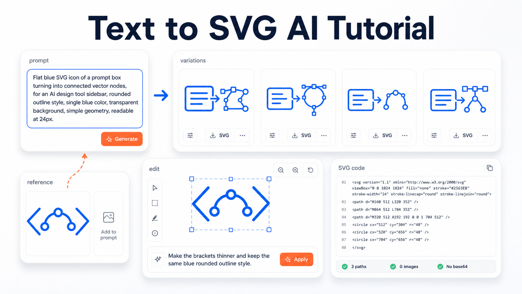
Flat blue SVG icon of a prompt box turning into connected vector nodes, for an AI design tool sidebar, rounded outline style, thick single blue stroke #2563EB, transparent background, simple geometry, visible blue lines, readable at 24px.
This prompt gives the generator an asset type, subject, metaphor, use case, style, color, background, and size constraint.
For this exercise, choose Classic or Ultra in the generation settings:
Mode
Best use
Classic
Fast, balanced options for icons, badges, and early logo concepts.
Ultra
Higher detail and polish when the asset needs more finish.
Start with one SVG while you establish the style. If you want to compare directions, choose multiple variations as shown below. Review the displayed credit cost for your selected model and quantity before generating.
These screenshots show the interface used for the earlier example. In the September 14 composer, the visible settings were model, quantity and background; no separate ratio selector appeared. Keep the available settings and written composition requirements consistent when comparing your own outputs.
Choose The Strongest Variation
The first generation should not be judged like a finished logo. Judge it like a style direction.
For an icon-set anchor, choose the result that has the clearest rules:
Check
What to choose
Subject clarity
The prompt-box and vector-node idea reads quickly.
Small-size readability
The icon still makes sense at 24px or 32px.
Shape language
Corners, strokes, and node details feel repeatable.
Color discipline
The output stays close to the requested single blue.
Editability
The design looks like it can be simplified or adjusted later.
Do not pick the most detailed result if the rest of the set will be used in a UI. Pick the result that gives you the most reusable visual language.
Turn One Prompt Into A Prompt Family
Once the anchor direction works, create the rest of the set by changing the subject while keeping the style suffix nearly identical.
Icon
Prompt
Prompt to nodes
Flat blue SVG icon of a prompt box turning into connected vector nodes, for an AI design tool sidebar, rounded outline style, thick single blue stroke #2563EB, transparent background, simple geometry, visible blue lines, readable at 24px.
Code brackets
Flat blue SVG icon of code brackets containing a simple curved vector path, for an AI design tool sidebar, rounded outline style, thick single blue stroke #2563EB, transparent background, simple geometry, visible blue lines, readable at 24px.
Reference reuse
Flat blue SVG icon of an image card becoming a clean vector outline, for an AI design tool sidebar, rounded outline style, thick single blue stroke #2563EB, transparent background, simple geometry, visible blue lines, readable at 24px.
Editor refine
Flat blue SVG icon of a selection box around vector nodes, for an AI design tool sidebar, rounded outline style, thick single blue stroke #2563EB, transparent background, simple geometry, visible blue lines, readable at 24px.
That is the core text-to-SVG tutorial pattern:
[Subject and metaphor], for [use case], [same style lock].
Avoid rewriting the style differently each time. Prompts like "minimal," "modern," "sleek," and "simple" may all sound similar to a person, but they can push the outputs in different directions. Keep the visual rules stable.
Use References To Keep The Set Consistent
If the second or third icon starts drifting, use the best icon as a reference.
A reference-guided prompt should say what the image is for. Do not just attach an icon and hope the next output copies the right parts.
Use a prompt like this:
Use the attached icon as the style reference. Create a new SVG icon of code brackets containing a simple curved vector path. Keep the same rounded outline style, same blue color, same transparent background, and same simple 24px readability. Change only the subject.
The code-brackets result below uses rgb(9,93,233), which differs from the requested #2563EB. Compare its palette with the rest of your set and replace the fill value directly if you need an exact match.
This gives SVG AI two kinds of context:
Input
Job
Reference image
Shows the style, stroke feel, color, and composition density.
Text prompt
Names the new subject and says what should change.
Use text-only prompts when you are exploring. Use references when you are matching.
Refine The Weakest Icon
After reviewing the set, choose the icon whose weight, spacing or detail needs the most attention. Try one focused correction while keeping the other icons as references. The screenshots below show where to open the editor and enter that request.
The result action menu lets you keep working from a generated SVG: edit, download, add the design back into the prompt, copy SVG code, zoom the preview, or show the grid.
Open the weakest icon in the editor and make a specific edit request.
Good edit prompts for icon sets:
Problem
Edit prompt
Too heavy
Make the stroke thinner and keep the same subject, same blue color, and transparent background.
Too much detail
Simplify this icon into fewer shapes while keeping the same rounded outline style.
Inconsistent style
Make this icon match the attached icon set: rounded outline, single blue, simple geometry, readable at 24px.
Weak metaphor
Make the code-brackets idea clearer, but keep the same blue vector-node style.
The history panel is useful because it lets you compare the original and edited direction before committing to the new version. In the screenshot above, the version panel stays visible while the edit prompt is being written.
For a set, refinement should usually be conservative. The goal is not to create a completely new design. The goal is to make one icon obey the same rules as the others.
Download And Inspect The SVG
When the set looks good, choose Download SVG. SVG downloads require paid access through an eligible subscription or credit purchase. Open each saved file and compare its code and appearance before adding it to your project.
For the reference-guided code-brackets icon, the copied output:
started with an <svg> element
included 3<path> elements
included 0<image> elements
included no base64 raster payload
That check matters because an editable SVG is not the same thing as a bitmap preview wrapped in an SVG file.
Use this quick inspection checklist for every icon in the set:
Check
Good sign
Warning sign
Root element
File starts with <svg
File is actually PNG/JPG despite the extension
Vector markup
Contains path, circle, rect, polygon, line, or text
Mostly one <image> tag
Raster payload
No long data:image/...;base64 string
Large embedded base64 image block
Editability
Shapes can be selected in a vector editor
Whole asset behaves like one flat image
Consistency
Similar viewBox, stroke feel, color, and density
Each icon looks like it came from a different set
The complete code-brackets SVG is 4,433 bytes with three paths, a viewBox of 88 604 1872 833.333, and no embedded image. Download the file to inspect those attributes yourself.
A complete manual comparison set
These hand-coded SVG examples show the four developer-tool subjects with one consistent outline style. Download them to inspect their shared attributes or practice a small source edit. The crowded editor icon gives you a simple cleanup exercise.
Same subject with five unnecessary horizontal bars
The manual correction removes the five extra bars while keeping the selection corners, pencil, viewBox, color and stroke settings. Compare both at 24px in the icon examples page to see how removing detail helps the symbol read.
A route with fewer credits
Write the four briefs before generating.
Generate one anchor and judge it at 24px.
If the anchor fails the style rule, make one targeted revision before generating siblings.
Generate the next subject only after the anchor is usable; use it as a reference where available.
Use a manual color or attribute edit when the design is good and only implementation details differ.
Save the prompts, settings and useful outputs with the project. Check the composer's current credit cost as you work; a precise manual color edit can be a simpler next step when the generated shape already fits.
Use The Icons In A Real Workflow
Once the SVGs pass inspection, make the set easy to use.
For a web product:
Step
Practical rule
Name files clearly
Use names like icon-prompt-nodes.svg, icon-code-brackets.svg, icon-reference-reuse.svg, and icon-editor-refine.svg.
Keep color decisions intentional
Leave the requested blue if it is brand-specific, or normalize fills/strokes in your design system.
Check small sizes
Test at 24px, 32px, and 48px before shipping.
Optimize after visual review
Check the artwork first, then compare its appearance after reducing file size.
Keep the best prompt
Save the prompt family so future icons can match the set.
For a design tool, import all icons into the same Figma or Illustrator frame and compare them side by side. For cutting, engraving, or print, inspect the final paths against the production requirement before sending the file to a machine or vendor.
The point of text-to-SVG AI is not only speed. It is repeatable creative direction: prompts, references, variations, edits, and final SVG checks working together.
Common Text-To-SVG Mistakes
Mistake
Better approach
"Make me an icon set"
Generate one anchor icon first, then build the rest from a shared style lock.
Changing style words every prompt
Reuse the same visual suffix across the set.
Asking for too many ideas in one icon
Give each icon one subject and one metaphor.
Ignoring small-size readability
Add readable at 24px or simple geometry to the prompt.
Forgetting transparent background
Include transparent background in every prompt.
Treating the first result as final
Compare variations and refine the weakest icon.
Downloading without inspection
Check for real vector elements and no raster wrapper.
When To Read The Complete Guide Instead
Use this tutorial when you want to make a small matching asset set.
Use the complete text to SVG AI guide when you want the broader explanation of:
what text-to-SVG means in 2026
input choice and exact lettering versus prompted artwork
when to use text-only prompts versus reference images
how variations, edits, and SVG inspection fit together
how text-to-SVG differs from image-to-SVG conversion
If you are starting from an existing PNG, JPG, screenshot, or logo image and want direct conversion, use the image to SVG converter instead.
Frequently Asked Questions
What Is The Best First Prompt For Text To SVG AI?
The best first prompt names the asset type, subject, use case, style, color, background, and output constraint. For example: Flat blue SVG icon of a prompt box turning into connected vector nodes, for an AI design tool sidebar, rounded outline style, thick single blue stroke #2563EB, transparent background, simple geometry, visible blue lines, readable at 24px.
How Do I Make A Matching SVG Icon Set With AI?
Create one strong anchor icon first. Then reuse the same style lock across every related prompt: asset type, line style, color, background, geometry, and target size. If a later icon drifts, use the anchor icon as a reference image.
Should I Use A Reference Image Or Just Text?
Use text-only prompts when you are exploring a new idea. Use a reference image when you need the next icon to match an existing result, sketch, logo, screenshot, or style direction.
Can Text-To-SVG AI Make Production-Ready Icons?
It can create useful starting designs, including the downloadable set above. Before using an icon in a finished product, inspect the SVG code, compare it at the target size, and refine the colors, spacing and detail that matter in your layout.
How Do I Check If My SVG Is Editable?
Open or copy the SVG code. Look for vector elements such as path, circle, rect, polygon, line, or text. If the file mostly contains an <image> tag with base64 data, it is probably a raster wrapper rather than an editable vector SVG.
What Should I Do If The Icons Do Not Match?
Pick the strongest icon as the style reference, attach it to the next prompt, and explicitly ask SVG AI to preserve the same rounded outline style, color, background, and 24px readability while changing only the subject.


 For the manual finish, set each fill to


 For this exercise, choose Classic or Ultra in the generation settings:
 These screenshots show the interface used for the earlier example. In the September 14 composer, the visible settings were model, quantity and background; no separate ratio selector appeared. Keep the available settings and written composition requirements consistent when comparing your own outputs.
 For an icon-set anchor, choose the result that has the clearest rules:
 A reference-guided prompt should say what the image is for. Do not just attach an icon and hope the next output copies the right parts.
Use a prompt like this:
A reference-guided prompt should say what the image is for. Do not just attach an icon and hope the next output copies the right parts.
Use a prompt like this:
 This gives SVG AI two kinds of context:
 Open the weakest icon in the editor and make a specific edit request.
 Good edit prompts for icon sets:
 That check matters because an editable SVG is not the same thing as a bitmap preview wrapped in an SVG file.
Use this quick inspection checklist for every icon in the set:
That check matters because an editable SVG is not the same thing as a bitmap preview wrapped in an SVG file.
Use this quick inspection checklist for every icon in the set:


